A color wheel is a versatile tool that you can use in many different ways for many different purposes, which may help you create some amazing food photography. Have you ever tried desperately to make a photo or piece of art perfect, only to fail or feel like something is vaguely off about your project? Your color palette might be behind that feeling in your photo.
Color theory can be traced back to Sir Isaac Newton’s experiments with prisms. His theory that red, yellow, and blue are the three primary colors is shown in his own wheel. Many people from the 1800s agreed with him. Although this theory is not completely true, it was very influential on other color wheels and theories of today.
Studying color theory is a great way to meld artistry and science together. All kinds of visual art, from painting to pastry-making, benefit from an eye for art and design. Color theory offers a reliable, practical way to orchestrate art through tried and true color combinations and guidelines.
For starters, it's important to know what color theory means in photography terms. Color Theory refers to all the aspects of the color relationship, such as hue (color), value (brightness), and temperature (warm or cool). It's these relationships that help create an interesting photo with contrast and depth.
Today, we’re taking a look at color theory, also known as color schemes, and how tried and true methods of mixing and marrying colors and hues can improve your food photos by leaps and bounds.
Color Wheels: Primary, Secondary, and Tertiary Color
The simplest way to think of color theory is to consider it a method to choosing colors effectively. Learning about color wheels and how to pair colors is a good start if you want to learn more about photography.
Even if you have a clear vision in mind, sometimes a finished product doesn’t look quite right. Going back to the basic principles of color theory can quickly help you identify a mismatched color scheme and identify better ways to capture your viewer's attention.
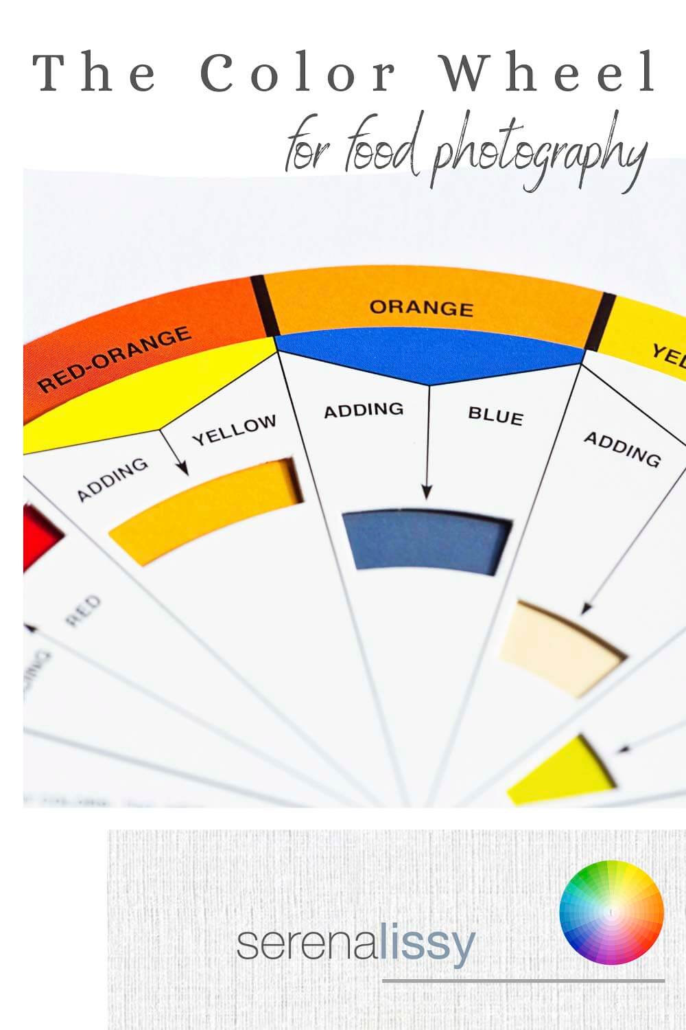
From the top, there are three color schemes on the color wheel to learn. The primary color wheel focuses on the same three colors that Sir Isaac Newton once focused on: red, yellow, and blue. The secondary colors are violet, green, and orange. Finally, the tertiary colors are made up of mixes of secondary colors.
The idea that you can make all colors with a combination of primary colors is convenient but not completely true. For example, it would be very hard or impossible to get anything close to a neon pink color from the primary colors alone!
Still, these color wheels are my favorite way to explore different color pairing options for most foods.
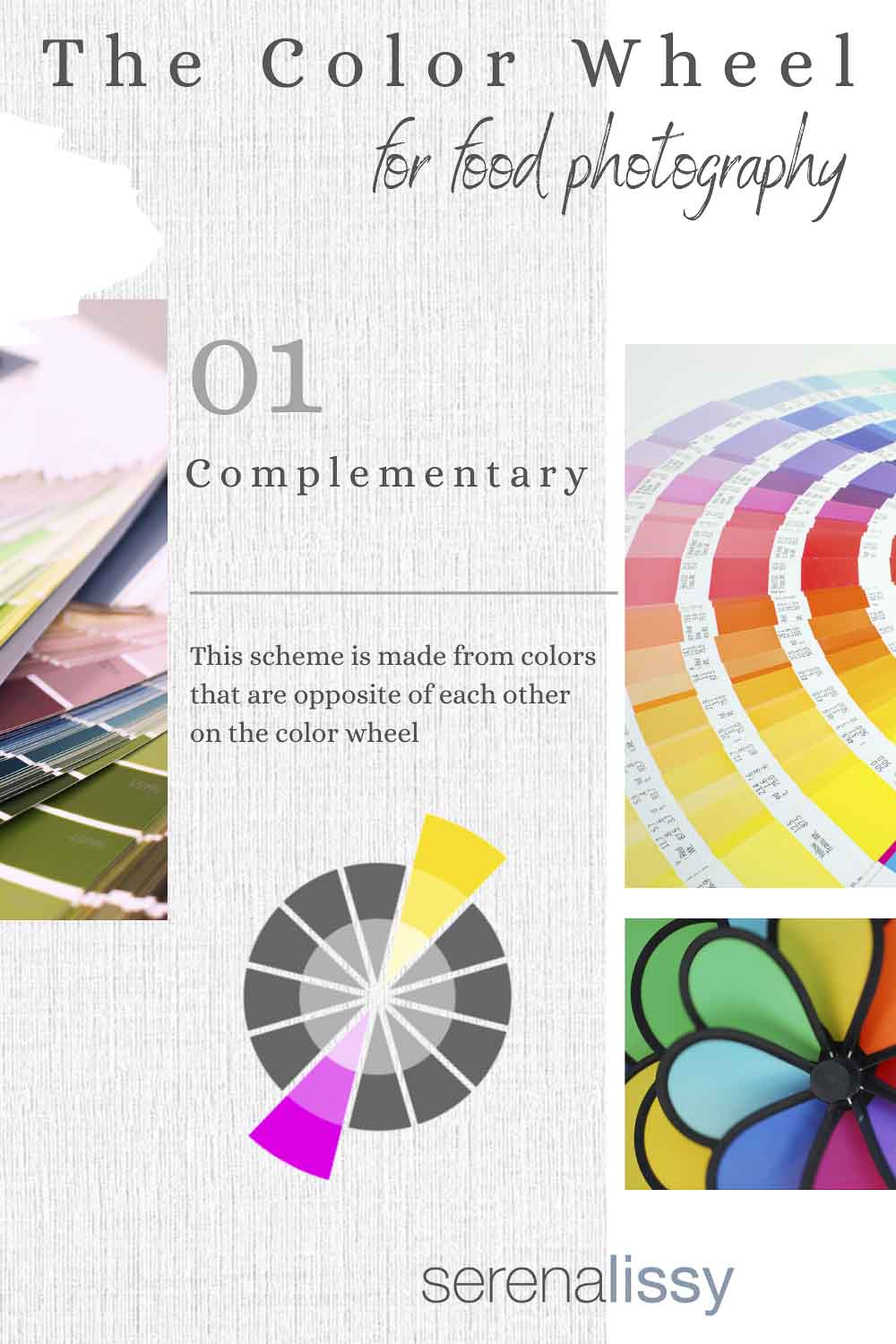
Complementary Colors
Complementary color pairings consist of colors located on opposite sides of the color wheel, allowing for really bold color contrasts that work well with any photograph. Some popular choices for complementary color choices include red and green, as well as orange and blue. For instance, if I was photographing red peppers, I might want to use a green background for design elements in the food photo.
When it comes to food photography, you can create complementary compositions with food items alone or as a combination of food and props.
Baking a delicious golden-orange crusted pie? Try using a blue-patterned napkin as a backdrop or a pie tin or plate with blue tones.
Creating a deliciously crunchy Asian-sesame salad? Throw in some yellow/orange croutons or wonton strips. While these won’t give you the striking complementary colors of green and red, the contrast will pair beautifully enough for an engaging photo.
Our Dulce de Leche Cookie recipe results in beautifully cream-colored cookies with powdered sugar on top. Yet our photos of this cookie also highlight red berries and green fir tree pieces to highlight the winter holiday season with complementary colors.
The great thing about complementary colors is they highlight each other, so this technique looks best with some great light sources on your subject (natural or artificial).
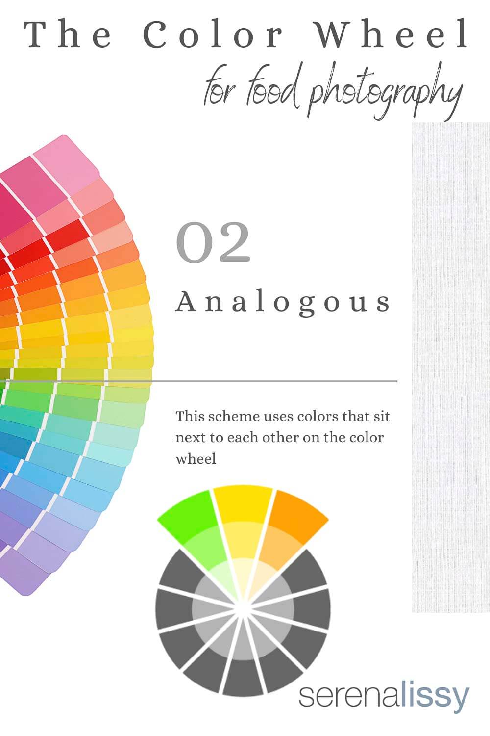
Analogous Colors
Analogous colors are colors that are next to each other on the color wheel. Think of a sunset or a gradient. For example, orange, red-orange, and red are all analogous to each other.
Rainbow-colored or themed macaron cookies are often prepared and packaged in analogous colors for a beautiful gradient effect.
Our Manchego Cheesecake recipe results in a perfect piece of sweet cheesecake. It’s also reliant on graham cracker crumbs for extra texture. The yellow cheesecake paired with orange/brown crumbs and a pink blackberry puree results in a beautiful array of analogous colors.
A feast for both your eyes and your soul!
Monochromatic Colors
Monochromatic colors consist of tints and shades of the same color. So, a pack of macarons containing pastel blue, sky blue, and dark blue cookies would be highlighting monochromatic colors.
Here at SerenaLissy.com, we have an absolutely delicious recipe for Mascarpone Cream Macarons with Berries. The recipe calls for red food coloring, fresh berries, and berry puree gel. These result in different shades of pink and red and orange for a beautiful composition of monochromatic colors. I love to play with the basics of color theory to get better food photography.
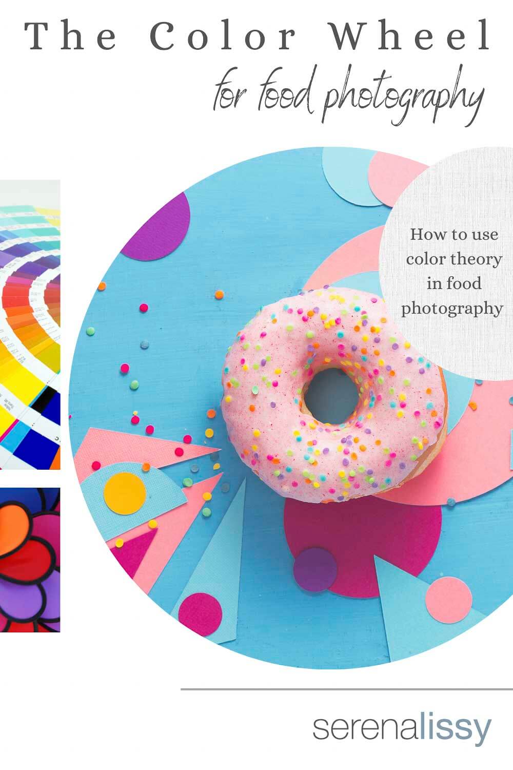
Use of Color Theory in Food Photography
Have we convinced you to grab a color wheel to hang in your kitchen yet? Simply turning to a color wheel for some extra assistance when lining up a shot is a great way to ensure that every eye will appreciate your treat.
In addition to choosing color pairings, there are a few tried and true ways to double-check your color choices in baking. First, ensure that you know what the main color of your main subject and photo will be. Next, have a general idea of the food story you are trying to tell. Then, determine the intended feeling or different moods you wish to create with your food and photo.
If you’re creating a refreshing acai bowl or drink, cooler colors may be the way to relax the viewer subconsciously. These might include blues, greens, and purples. If you’re looking for something warm and inviting, warm colors can simulate a feeling of a friendly campfire or beach. Use colors like red, orange, and yellow.
Finally, once you’ve identified your must-have colors and mood of the shoot, identify how you can fill in any gaps in the photo with props. For example, use a plain white or black background for food items that are already colorful and complex. Remember, the goal is to create a beautiful image with visual interest and capture your viewer's attention.
Don’t be afraid to throw in analogous or completely busy pattern fabrics as props if your food item lacks color. And if you happen to have a large baking weekend or session, remember that other baked goods can be props in photos, too! So put on your food stylist's hat and show off all of your hard work using these simple tips.
Ready To Learn More?
Food photography is an art form that takes time to be perfected. It’s not as easy as clicking a button and taking a photo. You need to know how colors work together for different types of food and what kind of lighting will make your subject stand out against its background. The color wheel can help you understand which colors go well with one another. And also when they should be used in your project- like when photographing certain foods or doing graphic design on a website. If this sounds intimidating, don’t worry! We have some great articles about food photography tips here at our blog so check them out for more information (and practice!).
Ready to learn more about food photography at home? Read our article on 15 Food Photography Props You Probably Have at Home for some tried-and-true easy ways to start taking photos.
The Five Day Food Photography Challenge
Want to take your food photography up a notch?
I’ve been photographing food for years and have learned some tricks of the trade. Join me on this 5-day challenge where you’ll learn how to master the art of food photography, one bite at a time. You’ll be amazed by what you can do with just a few simple tips. You will learn how to make your photos pop with color, texture, and lighting. Sign up today!
Looking For More Recipes?
Subscribe to my free newsletter to get new baking tips in your inbox monthly. Find me sharing new recipes and tips on Pinterest, Instagram, or Facebook.
As an Amazon Associate and member of other affiliate programs, I earn from qualifying purchases. What that means is if you click on one of our affiliate links, they may toss a few pennies our way for a commission.
Karen says
I really do need tips on food photography- going to check out your course later this week. Thanks!
serena says
Thanks Karen!
Katherine Fox says
This is so helpful because I'm always trying to take great food photos but I haven't figured out the trick yet lol. Your suggestions are perfect and I'll be pinning this so I can go back to it next time I'm trying my best to make the food look as good in a photo as it is in real life!
serena says
Thanks Katherine!
Mimi says
I've never thought about this but it's so clever, thanks for the tips
serena says
Thanks Mimi!
Heather says
I never thought to use the color wheel for food photography! I'm going to try it next time!
serena says
I'd love to hear how it turns out. It's so helpful!